# 주요 인수 matplotlib.patches.FancyArrowPatch((first_x, first_y), # 화살표의 꼬리 지점 좌표(x, y) (last_x, last_y), # 화살표의 머리 지점 좌표(x, y) mutation_scale, # 화살표 머리 크기 **kwargs # 그 밖의 인수들)
2. FancyArrowPatch의 그 밖의 인수들
특히, 그 밖의 인수들 중
주요 인수는 아래와 같습니다.
# 그 밖의 인수들 중 주요 인수 1. alpha - 0 ~ 1 사이의 값으로 타원의 투명도를 나타냄 - 숫자가 커질수록 투명도가 낮아짐
## 기본 라이브러리 세팅 import matplotlib.pyplot as plt import pandas as pd
## 한글 사용 가능하도독 폰트 설정 # window import matplotlib matplotlib.rcParams ['font.family'] = 'Malgun Gothic' # 한글 폰트 사용 시 (-) 부호 깨짐 현상 해결 matplotlib.rcParams ['axes.unicode_minus'] = False
# 타원 그래프 삽입을 위한 모듈 로딩 import matplotlib.patches as patches
위에 링크되어 있는 실습 자료를 기준으로
막대 그래플 그려 볼게요.
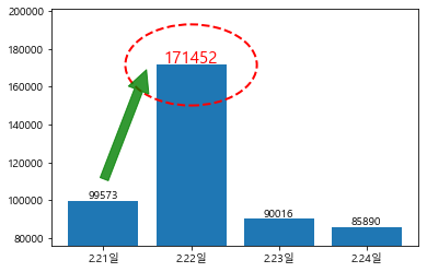
## 기초 데이터 x = ['2.21일', '2.22일', '2.23일', '2.24일'] y = [99573, 171452, 90016, 85890]
## 가장 빈도수가 높은 날짜에 타원 그래프 추가하기 plt.bar(x, y) plt.ylim([min(y) - 10000, max(y) + 30000]) for i, txt in enumerate(y) : if txt == max(y): plt.text(i, txt + 1500, txt, ha = 'center', color = 'red', size = 15) ellipse = patches.Ellipse((i,txt), width = 1.5, height = txt/4, color = 'red', fill = False, linestyle = 'dashed', linewidth = 2, alpha = 1) plt.gca().add_patch(ellipse) else: plt.text(i, txt + 1500, txt, ha = 'center')
for i, txt in enumerate(y) : if txt == max(y): plt.text(i, txt + 1500, txt, ha = 'center', color = 'red', size = 15) ellipse = patches.Ellipse((i,txt), width = 1.5, height = txt/4, color = 'red', fill = False, linestyle = 'dashed', linewidth = 2, alpha = 1) plt.gca().add_patch(ellipse) else: plt.text(i, txt + 1500, txt, ha = 'center')
## 2.21일 대비 2.22일 증가 수준을 화살표로 표현 arrow = patches.FancyArrowPatch((0,110000), # 화살표의 x 좌표 (0.5,170000), # 화살표의 y 좌표 mutation_scale = 40, color = 'green', fill = True, alpha = 0.8) plt.gca().add_patch(arrow)