import matplotlib.pyplot as plt # matplotlib 라이브러리 load
## 한글 사용 가능하도독 폰트 설정 import matplotlib matplotlib.rcParams['font.family'] = 'Malgun Gothic' # os: window matplotlib.rcParams['axes.unicode_minus'] = False # 한글 폰트 사용 시 (-) 부호 깨짐 현상 해결
이렇게 설정하면,
그래프에 한글과 (-) 부호 사용에 대한 걱정이 없어요.
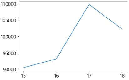
매우 간단한 데이터를 생성해 볼게요.
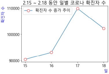
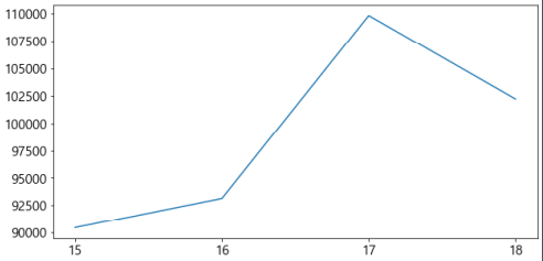
x = ['15', '16', '17', '18'] # 15일, 16일, 17일, 18일을 의미 y = [90443, 93135, 109831, 102211] # 위에 대응되는 날에 대한 코로나 확진자 수
선 그래프 그리기
기본 그래프(.plot())
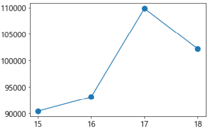
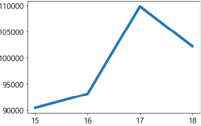
위의 데이터를 이용해서 가장 기본적인 선 그래프를 그려 볼게요.
plt.plot(x, y) # x: x축, y: y축에 대응되는 데이터
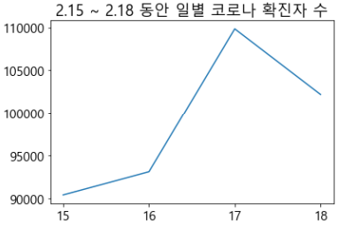
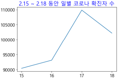
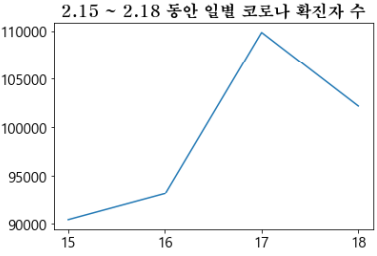
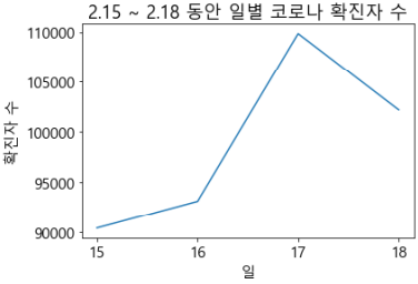
다음에는 그래프에 제목(titile)을 달아볼게요.
제목 달기(.title())
plt.plot(x,y) plt.title('2.15 ~ 2.18 동안 일별 코로나 확진자 수') ## 글자 색상 'blue'로 변경 plt.plot(x,y) plt.title('2.15 ~ 2.18 동안 일별 코로나 확진자 수', color = 'blue') ## 폰트와 크기 변경 plt.plot(x,y) plt.title('2.15 ~ 2.18 동안 일별 코로나 확진자 수', fontdic = {'family':'HYMyeongJo-Extra', 'size':17})
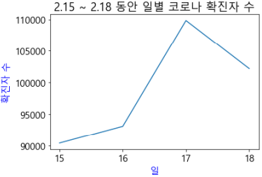
x축 데이터에 대한 설명과
y축 데이터에 대한 설명을 추가해 볼게요.
축 설명 추가(.xlabel() / .ylabel())
plt.plot(x,y) plt.title('2.15 ~ 2.18 동안 일별 코로나 확진자 수') plt.xlabel('일') plt.ylabel('확진자 수')
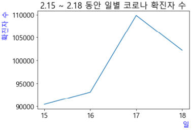
## 축 색상 지정 plt.plot(x,y) plt.title('2.15 ~ 2.18 동안 일별 코로나 확진자 수') plt.xlabel('일', color = 'green') plt.ylabel('확진자 수', color = 'green') ## 축의 위치 지정 plt.plot(x,y) plt.title('2.15 ~ 2.18 동안 일별 코로나 확진자 수') plt.xlabel('일', color = 'blue', loc = 'right') # 위치 지정은 'left', 'center', 'right' 가능 plt.ylabel('확진자 수', color = 'blue', loc = 'top') # 위치 지정은 'top', 'center', 'bottom' 가능
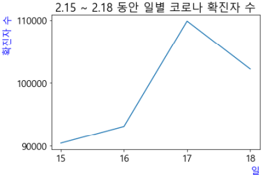
## 축의 표시값 지정 plt.plot(x,y) plt.title('2.15 ~ 2.18 동안 일별 코로나 확진자 수') plt.xlabel('일', color = 'blue', loc = 'right') # 위치 지정은 'left', 'center', 'right' 가능 plt.ylabel('확진자 수', color = 'blue', loc = 'top') # 위치 지정은 'top', 'center', 'bottom' 가능 plt.yticks([90000, 100000, 110000])
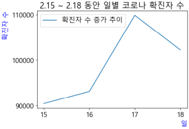
이제는 선 그래프에 대한 범례를 추가할게요.
범례(.legend()) 추가
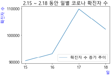
## 범례 추가 plt.plot(x,y, label = '확진자 수 증가 추이') plt.legend() plt.title('2.15 ~ 2.18 동안 일별 코로나 확진자 수') plt.xlabel('일', color = 'blue', loc = 'right') # 위치 지정은 'left', 'center', 'right' 가능 plt.ylabel('확진자 수', color = 'blue', loc = 'top') # 위치 지정은 'top', 'center', 'bottom' 가능 plt.yticks([90000, 100000, 110000]) ## 범례 위치 지정 plt.plot(x,y, label = '확진자 수 증가 추이') plt.legend(loc = 'lower right') plt.title('2.15 ~ 2.18 동안 일별 코로나 확진자 수') plt.xlabel('일', color = 'blue', loc = 'right') # 위치 지정은 'left', 'center', 'right' 가능 plt.ylabel('확진자 수', color = 'blue', loc = 'top') # 위치 지정은 'top', 'center', 'bottom' 가능 plt.yticks([90000, 100000, 110000])
# 범례 위치 지정과 관련된 인수 10개 # 'best', 'upper right', 'upper left', 'lower left', 'lower right', # 'right', 'center left', 'center right', 'lower center', 'upper center', 'center'
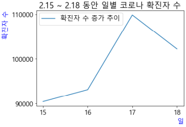
## 범례 위치를 수치로 표현 plt.plot(x,y, label = '확진자 수 증가 추이') plt.legend(loc = (0.02, 0.85)) # x축 데이터 기준 하위 2%, y축 데이터 기준 하위 85%(상위 15%) 지점을 기준으로 우상향으로 표현
plt.title('2.15 ~ 2.18 동안 일별 코로나 확진자 수') plt.xlabel('일', color = 'blue', loc = 'right') # 위치 지정은 'left', 'center', 'right' 가능 plt.ylabel('확진자 수', color = 'blue', loc = 'top') # 위치 지정은 'top', 'center', 'bottom' 가능 plt.yticks([90000, 100000, 110000])
자! 이제는 그래프 표식 옵션에 대해서 알아볼게요.
표식 옵션
표식 옵션은 아래 4가지 정도만 기억하시면 됩니다.
① 표식 모양, ② 표식 크기, ③ 표식 테두리, ④ 표식 채우기
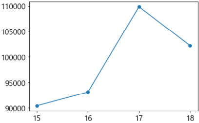
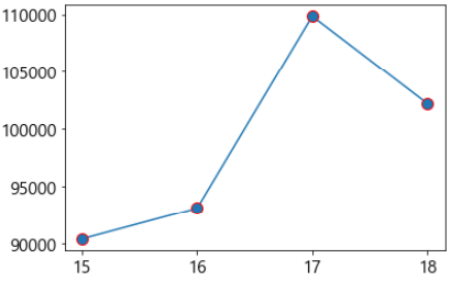
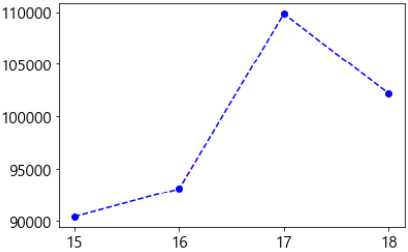
## 표식 스타일 지정 plt.plot(x,y, marker = 'o') # 표식 모양 plt.plot(x,y, marker = 'o', markersize = 10) # 표식 크기 설정 plt.plot(x,y, marker = 'o', markersize = 7, markeredgecolor = 'red') # 표식 테두리 색상 설정 # 표식 채우기 색상 설정 plt.plot(x,y,linewidth = 1, marker = 'o', markersize = 7, markeredgecolor = 'red', markerfacecolor = 'white') ## 지금까지의 그래프 결과를 1차적으로 정리하여 표현 plt.plot(x,y, label = '확진자 수 증가 추이', marker = 'o', markersize = 10, markeredgecolor = 'red', markerfacecolor = 'white') plt.legend(loc = (0.02, 0.85)) plt.title('2.15 ~ 2.18 동안 일별 코로나 확진자 수') plt.xlabel('일', color = 'blue', loc = 'right') plt.ylabel('확진자 수', color = 'blue', loc = 'top') plt.yticks([90000, 100000, 110000])
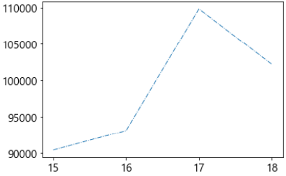
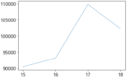
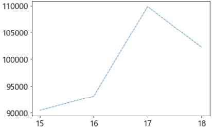
이제는 선 스타일에 대해서 조정해 보도록 하겠습니다.
선 스타일 지정
① 두께, ② 모양, ③ 색상, ④ 투명도
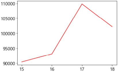
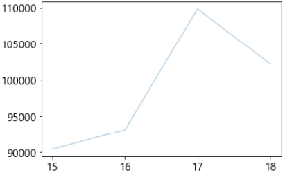
## 선 두께 설정 plt.plot(x,y, linewidth = 3) ## 선 스타일 지정 예시 plt.plot(x,y,linewidth = 1, linestyle = 'dashdot') plt.plot(x,y,linewidth = 1, linestyle = '--') plt.plot(x,y,linewidth = 1, linestyle = (0,(3,1,1,1))) ## 선 색상 지정 plt.plot(x,y,color='red') ## 선 투명도 지정 plt.plot(x,y, alpha = 0.5) ## 포맷(색상, 표식, 선 스타일)을 활용한 그래프 옵션 설정 plt.plot(x,y, 'bo--') # b: 색상 blue / o: marker / --: linestyle 표현
마지막으로 값을 텍스트로 나타내 보겠습니다.
텍스트 삽입
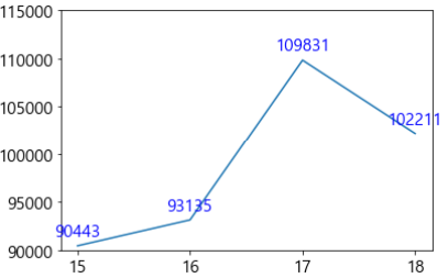
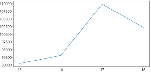
plt.plot(x,y) plt.ylim([90000,115000]) # y축의 범위를 90000 ~ 115000으로 고정
for i, txt in enumerate(y) : plt.text(x[i], y[i] + 1000 , txt, ha = 'center', color = 'blue') # ha는 텍스트 위치 ('left','center','right') 지정 인수
최종 그래프 그리기
지금까지 알아본 그래프 옵션들을 활용해서
최종 완성된 그래프를 그려 볼게요.
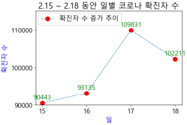
## 최종 완성된 그래프 그리기 plt.plot(x,y, label = '확진자 수 증가 추이', marker = 'o', markersize = 10, markeredgecolor = 'red', markerfacecolor = 'red', linestyle = '--', linewidth = 1, alpha = 1) plt.legend(loc = (0.02, 0.85)) plt.title('2.15 ~ 2.18 동안 일별 코로나 확진자 수') plt.xlabel('일', color = 'blue', loc = 'center') # 위치 지정은 'left', 'center', 'right' 가능 plt.ylabel('확진자 수', color = 'blue', loc = 'center') # 위치 지정은 'top', 'center', 'bottom' 가능 plt.yticks([90000, 100000, 110000]) plt.ylim([90000,115000])
for i, txt in enumerate(y) : plt.text(x[i], y[i] + 1000 , txt, ha = 'center', color = 'blue')
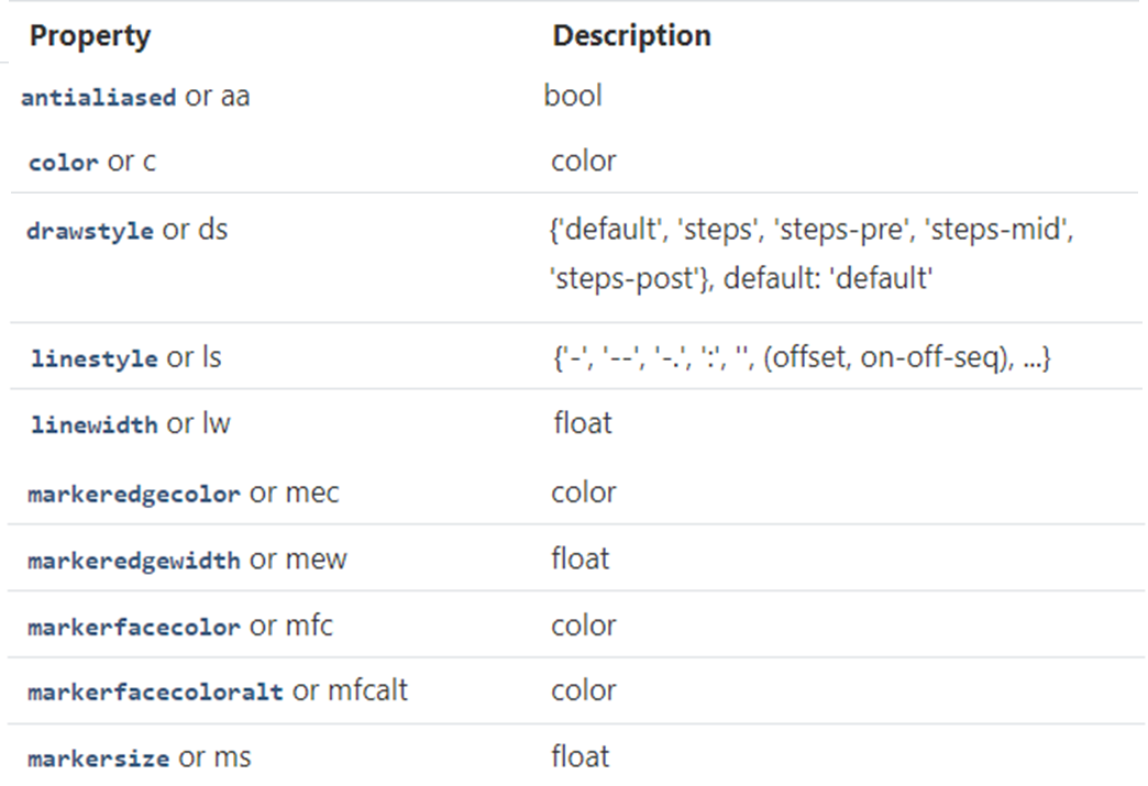
축약어
여러 그래프 옵션들 중에서 옵션 지정을 위해
markersize, markeredgecolor, markerfacecolor, linestyle 등
매우 긴 명령어를 입력해야 했는데요.
이를 축약해서 작성할 수도 있어요.
주요 명령어에 대한 축약어는 아래와 같아요.
(실습은 생략하도록 하겠습니다.)
<출처: matplotlib 라이브러리 홈페이지>
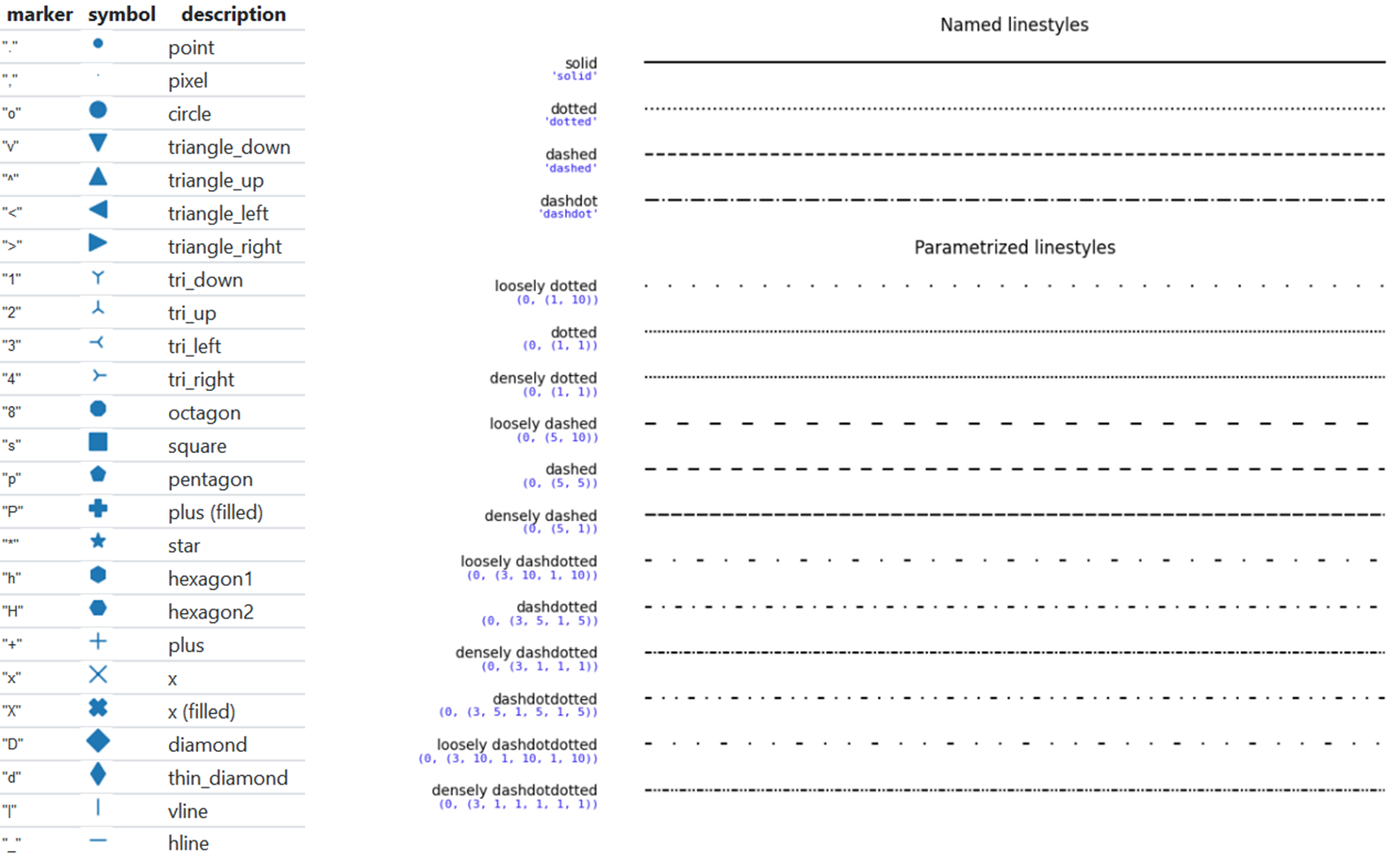
다양한 marker & linestyle
marker와 linestyle과 관련된 여러 인수들이 있어요.
<출처: matplotlib 라이브러리 홈페이지>
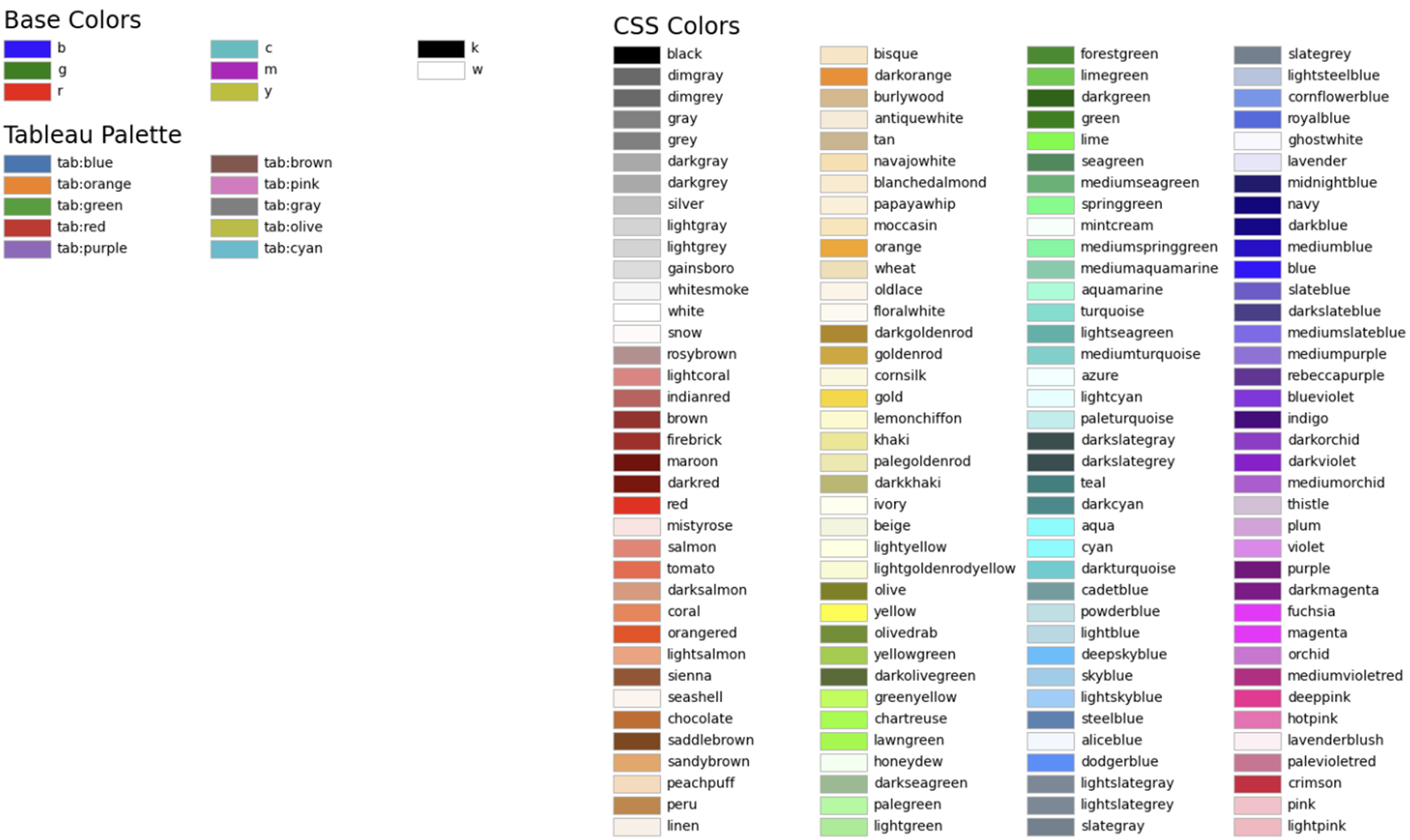
색상 명령어
color에 대한 값도 'blue', 'red', 'green' 이외에도 많은 값들이 저장되어 있어요.
참고하셔서 그래프를 예쁘게 꾸며 보세요.
<출처: matplotlib 라이브러리 홈페이지>
기타 환경 세팅들
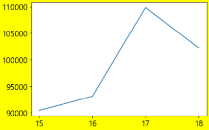
## 그래프 크기 조정 plt.figure(figsize = (10,5)) # figsize: 그래프 크기 plt.plot(x,y) ## 그래프 해상도 조정 plt.figure(figsize = (10,5), dpi = 200) # dpi (dots per inch): 해상도 조절 plt.plot(x,y) ## 배경색 설정 plt.figure(facecolor = 'yellow') plt.plot(x,y) ## 그래프 파일로 저장 plt.plot(x,y) plt.savefig("경로명/그래프파일명.png", dpi = 100)