R Graphics Cookbook을 기반으로 하여 작성하였습니다.
데이터 분포를 그래프로 표현하려고 합니다. 어떻게 하면 될까요?
아래 샘플 데이터를 활용해서 그래프로 표현해 보도록 할게요.
set.seed(1234) # seed값 부여
dat <- data.frame(cond = factor(rep(c("A","B"), each=200)),
rating = c(rnorm(200),rnorm(200, mean=.8)))
# 상위 몇 개의 일부 데이터 확인
head(dat)
library(ggplot2) # ggplot2 패키지 로드

Histogram and density plots
qplot 함수는 ggplot과 동일한 그래프를 생성하지만 구문은 더 단순합니다.
그러나 실제로는 qplot 옵션이 사용하기 더 혼란스러울 수 있기 때문에,
ggplot을 사용하는 것이 더 쉬운 경우가 많습니다.
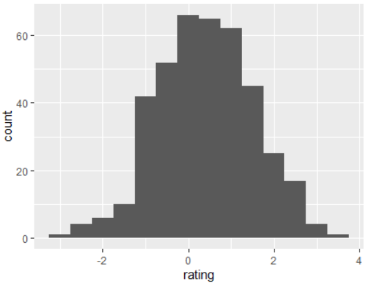
## 벡터 "rating"의 기본 히스토그램. 각 빈의 너비는 0.5
ggplot(dat, aes(x=rating)) + geom_histogram(binwidth=.5)
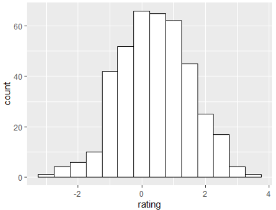
# 검은색 윤곽선, 흰색 채우기로 그리기
ggplot(dat, aes(x=rating)) +
geom_histogram(binwidth=.5, colour="black", fill="white")
# 밀도 곡선
ggplot(dat, aes(x=rating)) + geom_density()
# 커널 밀도 곡선이 중첩된 히스토그램
ggplot(dat, aes(x=rating)) +
geom_histogram(aes(y=..density..), # y축의 개수 대신 밀도가 있는 히스토그램
binwidth=.5,
colour="black", fill="white") +
geom_density(alpha=.2, fill="#FF6666") # 투명 밀도 플롯이 있는 오버레이
# 평균에 대한 선 추가
ggplot(dat, aes(x=rating)) +
geom_histogram(binwidth=.5, colour="black", fill="white") +
geom_vline(aes(xintercept=mean(rating, na.rm=T)),
color="red", linetype="dashed", size=1)


여러 그룹이 있는 히스토그램 및 밀도 플롯
# 오버레이 히스토그램
ggplot(dat, aes(x=rating, fill=cond)) +
geom_histogram(binwidth=.5, alpha=.5, position="identity")
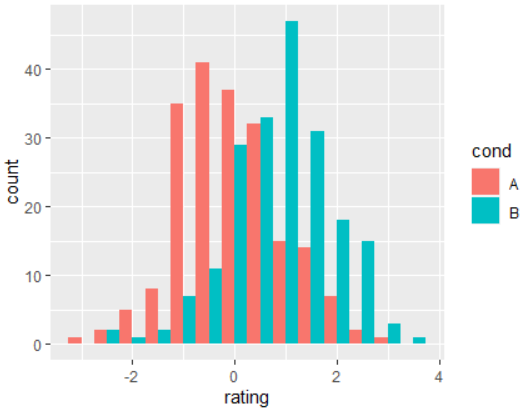
# 인터리브 히스토그램
ggplot(dat, aes(x=rating, fill=cond)) +
geom_histogram(binwidth=.5, position="dodge")
# 밀도 플롯
ggplot(dat, aes(x=rating, colour=cond)) + geom_density()
# 반투명 채우기가 있는 밀도 플롯
ggplot(dat, aes(x=rating, fill=cond)) + geom_density(alpha=.3)


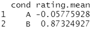
각 평균에 대한 행을 추가하려면 먼저 평균이 포함된 별도의 데이터 프레임을 생성해야 합니다.
# 각 그룹의 평균 찾기
library(plyr)
cdat <- ddply(dat, "cond", summarise, rating.mean=mean(rating))
cdat
# 평균이 포함된 오버레이 히스토그램
ggplot(dat, aes(x=rating, fill=cond)) +
geom_histogram(binwidth=.5, alpha=.5, position="identity") +
geom_vline(data=cdat, aes(xintercept=rating.mean, colour=cond),
linetype="dashed", size=1)
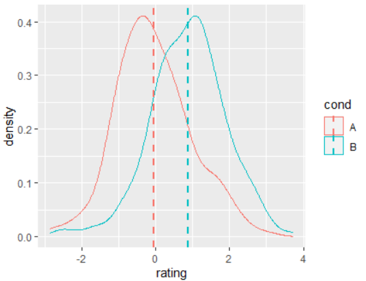
# 평균이 있는 밀도 플롯
ggplot(dat, aes(x=rating, colour=cond)) +
geom_density() +
geom_vline(data=cdat, aes(xintercept=rating.mean, colour=cond),
linetype="dashed", size=1)
# Using facets
ggplot(dat, aes(x=rating)) + geom_histogram(binwidth=.5, colour="black", fill="white") +
facet_grid(cond ~ .)
# 위의 cdat 데이터 객체를 사용하여 평균 선 추가
ggplot(dat, aes(x=rating)) + geom_histogram(binwidth=.5, colour="black", fill="white") +
facet_grid(cond ~ .) +
geom_vline(data=cdat, aes(xintercept=rating.mean),
linetype="dashed", size=1, colour="red")


Box plots
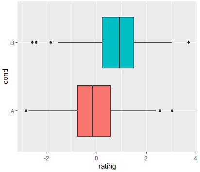
# 기초 box plot
ggplot(dat, aes(x=cond, y=rating)) + geom_boxplot()
# 조건이 색칠된 기본 상자
ggplot(dat, aes(x=cond, y=rating, fill=cond)) + geom_boxplot()
# 위의 내용은 중복 범례를 추가합니다. 범례 제거된 상태에서:
ggplot(dat, aes(x=cond, y=rating, fill=cond)) + geom_boxplot() +
guides(fill=FALSE)
# 뒤집힌 축으로
ggplot(dat, aes(x=cond, y=rating, fill=cond)) + geom_boxplot() +
guides(fill=FALSE) + coord_flip()


반응형
'R 프로그래밍 > R 데이터 시각화' 카테고리의 다른 글
| [R 그래픽스] 제목(Title) 달기 (0) | 2022.01.23 |
|---|---|
| [R 그래픽스] Scatterplots 그리기 (0) | 2022.01.22 |
| [R 그래픽스] 평균(means)과 오차(error) 막대그래프 그리기 (0) | 2022.01.08 |
| [R 그래픽스] 막대(Bar) 및 선(Line) 그래프 그리기 (0) | 2021.12.30 |
| 개요 (0) | 2021.12.27 |


댓글